

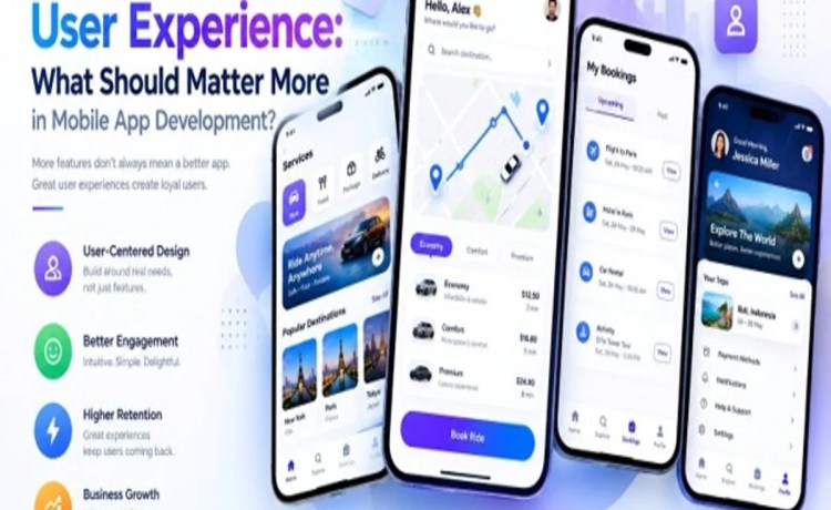
Walk into any product meeting and you’ll hear it eventually: “Can we just add one more feature?” It sounds harmless. Sometimes it even sounds necessary. But that single question, repeated across sprints and quarters, is how simple, delightful apps slowly turn into cluttered, confusing ones. The tension between feature quantity and user experience isn’t new, but it’s more relevant than ever in a market where users delete an app within seconds of feeling lost.
So which should actually matter more in mobile app development — packing in more features, or protecting the experience? The honest answer is that they’re not opposites to be balanced on a scale. They’re a hierarchy. And getting that hierarchy backwards is one of the most common ways good apps go bad.
The Seduction of “More”
It’s easy to understand why teams chase feature count. More features look impressive in a pitch deck. They give sales teams more to talk about. They make competitor comparison charts look better. And internally, they feel like progress — something shipped, something to show for the sprint.
But users don’t experience an app as a list of features. They experience it as a series of moments: opening the app, finding what they need, completing a task, closing the app satisfied (or not). If those moments are clogged with menus, settings, and options they never asked for, the feature count becomes irrelevant — worse, it becomes a liability.
This is the core problem with treating feature quantity in mobile app development as a proxy for value. A feature that 2% of users touch but that adds a decision point for 100% of users isn’t a net positive. It’s a tax that everyone pays so a few people can benefit.
Why User Experience Should Lead, Not Follow
User experience isn’t a coat of paint applied after the “real” work of building features is done. It’s the lens through which every feature decision should be filtered. Before a single line of code is written, the better question isn’t “can we build this?” but “does this make the core journey faster, clearer, or more satisfying?”
Apps that consistently prioritize user experience over raw feature quantity tend to share a few habits:
- They say no more often than they say yes to new requests.
- They measure success by task completion and retention, not feature count.
- They treat simplicity as a design goal, not a limitation.
- They test with real users before assuming a feature is wanted.
None of this means features don’t matter. It means features only matter when they serve the experience, not when they compete with it.
When Feature Quantity Actually Helps
To be fair, there are moments when adding capability genuinely improves an app. A missing feature that blocks a core task — say, an e-commerce app without saved payment methods — isn’t a nice-to-have; it’s a gap that hurts the experience by its absence. For multi-service platforms, a Gojek Clone App can similarly bring several useful services together, but the challenge is making those features easy to discover and use without overwhelming the user.
The distinction is intent. Features added to close a real gap in the user journey tend to improve mobile app development outcomes. Features added because a competitor has them, or because a stakeholder liked the idea in a meeting, tend to erode the experience over time, even if each one seems small in isolation.
The Compounding Cost of Clutter
Here’s what makes this tension dangerous: the damage from over-featuring an app rarely shows up immediately. One extra settings toggle doesn’t break anything. One additional onboarding screen doesn’t cause mass uninstalls. The cost compounds. Each small addition nudges the interface a little further from intuitive, and by the time a team notices the app “feels heavy,” dozens of individually reasonable decisions have stacked into an unreasonable whole.
This is why user experience deserves more weight than feature quantity as a guiding principle, not less. It acts as a check against the natural tendency of software to accumulate complexity. Without that check, even well-intentioned teams end up with apps that are technically more capable and practically less usable.
Think about the apps people describe as “just works.” They’re rarely the ones with the longest feature list. They’re the ones where every screen has an obvious next step, where the primary action is never buried, and where new capabilities are introduced only when they earn their place.
Practical Ways to Balance the Two
Balancing feature quantity in mobile app development with genuine user experience doesn’t require choosing one and ignoring the other. It requires a disciplined process:
Start with the core journey. Identify the two or three tasks that matter most to your users, and protect those paths fiercely. Any new feature that adds steps or ambiguity to that core journey needs a very strong justification.
Use data, not opinions, to decide. Feature requests often come from the loudest voice in the room, not the most representative user. Usage analytics, drop-off points, and support tickets tell a more honest story about what’s actually needed.
Treat every addition as a subtraction elsewhere. Every new element on a screen competes for attention with everything already there. Before adding, ask what could be removed, simplified, or hidden behind progressive disclosure.
Ship small, test real. Instead of building a feature fully formed based on assumptions, release a minimal version, watch how real users interact with it, and let that behavior — not internal enthusiasm — decide whether it grows or gets cut.
Give user experience a seat at the roadmap table. If design and UX research are only consulted after features are already scoped, the experience is already compromised. UX considerations need to shape what gets built, not just how it looks once built.
The Bottom Line
Feature quantity and user experience aren’t naturally at war, but they compete for the same limited resource: the user’s attention and patience. When teams optimize for feature count first, user experience becomes an afterthought, and the app slowly grows heavier and harder to love. When teams optimize for user experience first, features still get added — but only the ones that genuinely earn their place.
In mobile app development, the apps that last aren’t the ones that did the most. They’re the ones that did the right things well. That’s the real answer to which should matter more: user experience isn’t just equally important to feature quantity — it’s the standard feature quantity should be measured against.